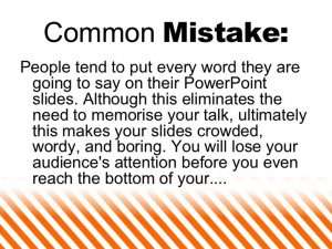
What does stand out is a bad PowerPoint presentation. Whether it’s too many lines of text, a disjointed flow, ugly photos, or poor design, bad PowerPoints detract from the message you’re trying to get across (while also undermining your own credibility as a professional or speaker).
Guy Kawasaki, marketing specialist, author, and Silicon Valley venture capitalist, is a proponent of the 10/20/30 Rule of PowerPoint. His guideline is simple: a PowerPoint presentation should have 10 slides, last no more than 20 minutes, and contain no font smaller than 30 points.
Here are some other rules to ensure your next PowerPoint presentation not only shines but also puts you in the best light.
Plan Ahead
The point of your slides is to illustrate and expand on what you are going to say to your audience. You should know what you intend to say and then figure out how to visualize it. Unless you are an expert at improvising, make sure you write out or at least outline your presentation before trying to put together slides.
Your script should follow good storytelling conventions and have a beginning, middle, and end. There should be a clear arc that builds toward some sort of highpoint. Your audience should enjoy each slide—and be eager to see the next one.
Make Each Slide to Cover Just One Point
While you’re speaking about something, what shows on the screen should only be that point. Your audience will instantly read every slide as soon as its displayed. If you have five points on the slide, your audience will be reading that—and they probably won’t be listening with much interest to the point you are making. Control the flow of information to keep you and your audience in sync.

Use Bullet Points
Remember that your slides are there to add to your presentation; they are not the presentation itself. Don’t try to create a standalone document by putting big chunks of text on your slide. PowerPoint has a function—called Presenter View—wherein you can display your notes on your screen without projecting it to your audience. You can also use plan old-fashioned notecards or a separate Word document.
Keep Your Design Attractive But Clean
Resist the temptation to add a lot of visual flash to your slides. Presentation packages, including PowerPoint, offer fades, swipes, flashing text, and other bling that can easily become annoying to viewers. Focus instead on the basics of simple design:
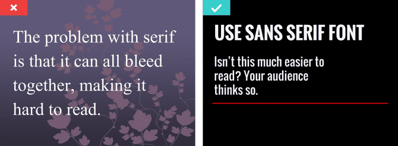
- Use an easy-to-read sans serif font for body text. Fonts like Arial, Helvetica, and Calibri tend to be the easiest to read on screens.
- Align text left or right. Centered text is harder to read and looks amateurish.
- Keep your design clutter-free. Each slide should include no more than a headline, a few bullet points, and maybe one image. Using too many elements on a slide means your audience will be focused on figuring out the slide rather than paying attention to you.
- If you are adding charts or tables to your presentation, be sure to keep them simple. Limit your slide to one point and (usually) one chart. Craft a slide title to make the meaning explicit, and highlight key data points with labels or color.

Ask Questions
Questions keep audiences interested and engaged, so don’t be afraid to ask a lot of them during your presentation. Build tension by asking a question and letting your audience consider it for a moment before moving on to the next slide that has the answer. If appropriate, engage in a little question-and-answer with your audience, with you asking the questions.
Conclusion
There is an art to creating a PowerPoint that will support a persuasive presentation and encourage engagement, rather than serving as a distraction. If PowerPoint isn’t your thing or you simply don’t have the time needed to create one yourself, a virtual assistant well-versed in PowerPoint or Google Slides can help you create a professional, appealing, and effective presentation made in no time.
